
Why brand guidelines get ignored
There's a moment I've witnessed dozens of times in my career: a project wraps up, the guidelines are delivered, the client is happy. And then, quietly I suspect, it gets filed away and never looked at again.
Having worked with many not-for-profits and social enterprises, I can now imagine what might happen. Six months later, a volunteer creates a flyer in a font that isn't in the guidelines, or a board member sends out an email with the old logo. Social posts start looking like they belong to three different organisations. The brand that was carefully built with beautiful design and good intentions begins to drift.
Is this a design problem, or an implementation problem?
Guidelines written for the wrong end-user
Most brand guidelines are created by designers, for designers. They document typefaces with technical precision, specify colour values in CMYK, RGB, and HEX (RIP Pantone), and outline grid systems and spacing ratios that require laser focus to apply correctly. I’ll admit, even my eyes glaze over when I am given a 60-page document to use. I tend to apply my finely honed ‘vibe recognition’ and simply double-check the bits I need, when I need them.
They can be useful when a designer is doing the work, but increasingly, they're not. Communications coordinators, marketing volunteers, program managers, and board members are creating brand outputs every day. People with no formal training in design are writing social posts, building presentations, designing event flyers, and producing grant applications. And when they reach for the brand guidelines to help them, they often find a document that assumes knowledge and tools they don't have.
So they do their best (don’t we all?). Which is how brand drift starts, not via negligence, but via the gap between the document that exists and the guidance people actually need.
It stands alone
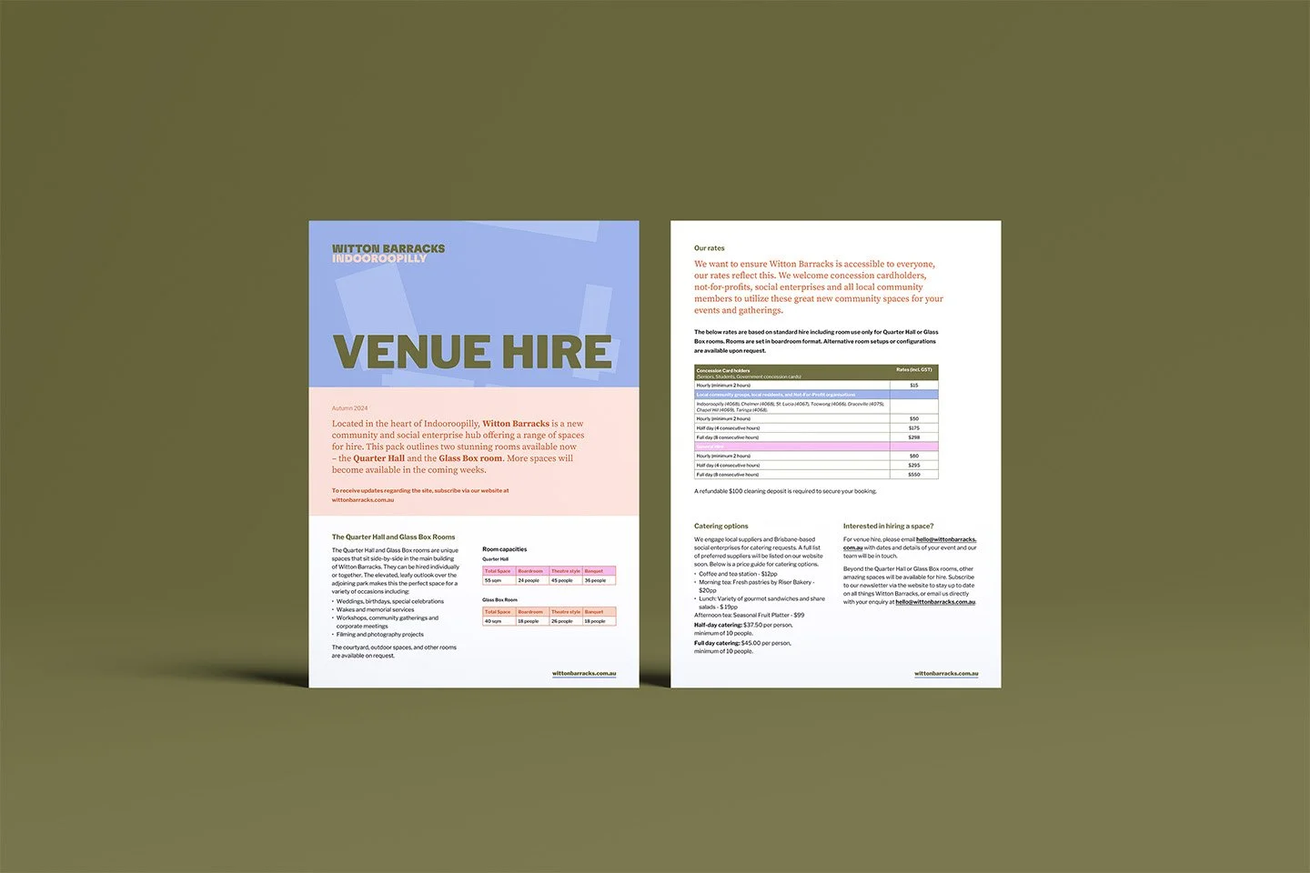
In the absence of useful tools, brand guidelines rely on people starting from scratch. And that rarely goes well. Why would it, when setting up margins, font specification and colour palettes is both tedious and time-consuming? Brand guidelines become far more effective when they are built in concert with a set of robust everyday document templates for people to click and open, ready to go.
My proudest moments as a brand practitioner have come from seeing high-quality colateral built by my clients; nothing to do with me, except that they were created from templates I once built.
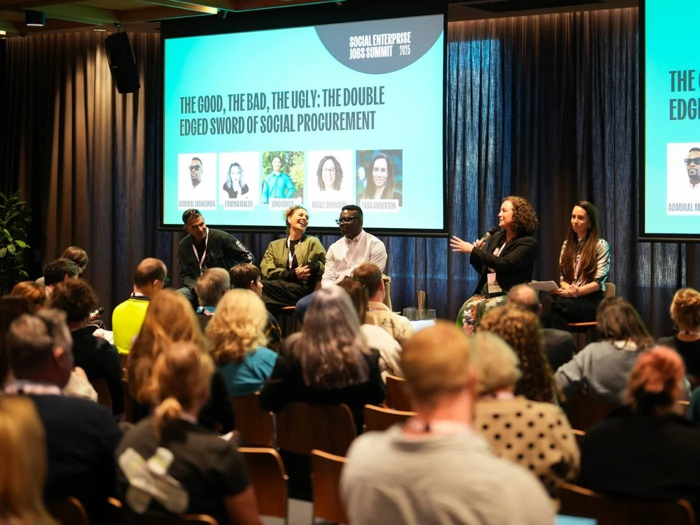
The Social Enterprise Jobs Summit: Enjoying an event where 100% of colateral was created through a carefully documented brand identity and templates that I had built six months earlier. Photo credit: SEJS
The 60-page PDF problem
Hands up if you’re guilty of this? Ahem, yes.
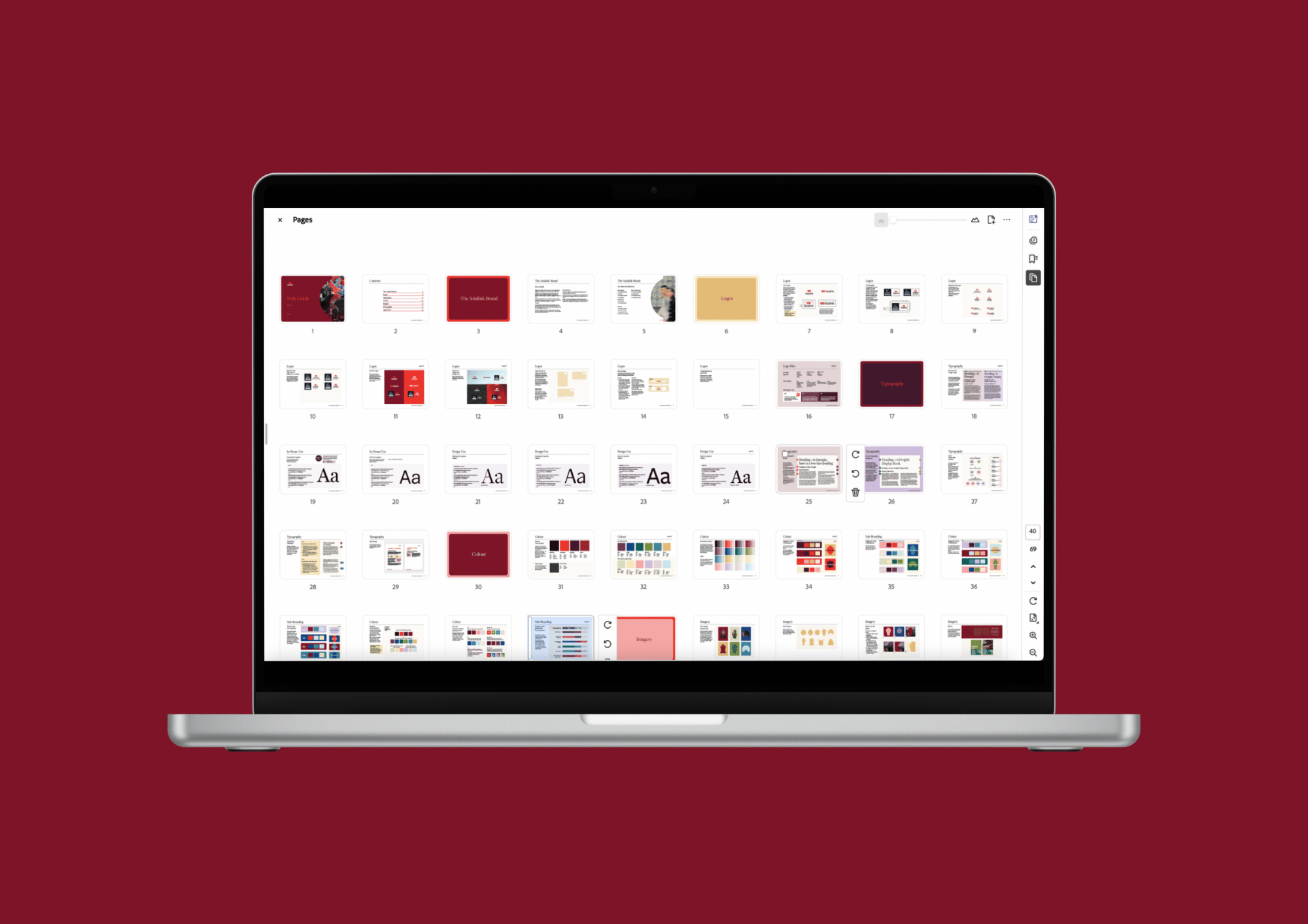
The 60-odd page PDF: Built for a team of in-house designers, most laypeople would find these Brand Guidelines unhelpful.
Length and thoroughness aren't virtues in today’s guideline document if they work against usability. A 60-page PDF is not a helpful tool to keep your brand tight: it's a reference document. Reference documents are consulted by specialists who know what they're looking for. A more helpful tool is something that can be used by non-designers who need to make a decision quickly and get back to their actual job.
The test for any brand guideline is simple: could the communications coordinator who just started last month use this document, unsupported, to produce something on-brand? If the honest answer is no, the document isn't doing its job, regardless of how well it's intended and designed.
What useful guidelines actually look like
The shift is from documenting rules to empowering people to make good decisions. Instead of specifying every possible application of the logo, a useful guideline answers the questions people actually ask when they're under pressure and need to produce something quickly.
What can’t change?
Every brand has non-negotiables — the elements that are so central to recognition and integrity that flexibility isn't an option. The logo, primary colour and perhaps the core typeface. These need to be clearly named as fixed, with a clear explanation as to why so that people understand the principle, not just the rule.
What has flexibility?
Equally important is naming what's OK to do. When a volunteer is making a poster and doesn't have access to the brand font, what's the acceptable substitute? When the finance team needs to use the Powerpoint template and only have Microsoft fonts available, what font should they use?
Rigid guidelines leave people guessing, whilst guidelines that say ‘here's what you can do’ actually get followed.
Microsoft is not going anywhere. Best to specify a Microsoft-friendly font before it defaults to something ugly.
Who do you ask?
Every set of guidelines should name a decision-maker. Not a generic "contact the marketing team" — a specific person, or a clear process, for when something falls outside what the document covers. Someone to hold the baby. Without this, people either make the call themselves (and get it wrong) or get stuck in approval paralysis.
Real examples, not just rules.
The most useful section in any brand guidelines document is a collection of real-world examples. What on-brand looks like in practice, and ideally, what off-brand looks like and why. Abstract rules are hard to apply, whereas concrete visual examples provide a real-world reference to work from.
Strongly templated documents make good examples of brand application that people can see and learn from.
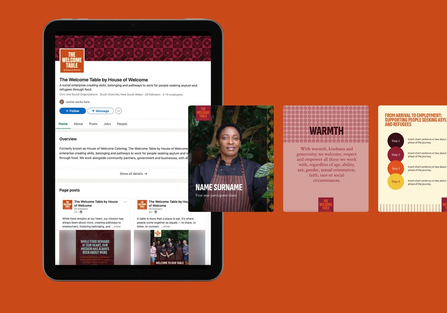
Not every scenario can be planned for, but having enough examples can provide a useful start for those executing brand on a day-to-day basis.
The AI and offshore execution challenge
This challenge has become more acute as organisations increasingly use AI tools and offshore design resources to manage costs. Both can produce competent-looking work that somehow misses the brand entirely. I suspect this is because they're working from whatever brief or prompt they've been given, which is rarely the full picture. Maybe English isn’t the designer’s first language and the guidelines fail to impart the nuance of brand application.
AI tools in particular have no inherent understanding of a brand’s core essence, and may see your brand as a ‘generic competitor in the category’. It will produce work that looks professional and derived from ‘what’s out there’. Whether it looks, feels and communicates like your brand depends entirely on the quality of the guidance they're given. AI has proven itself to be an invaluable tool in marketing and comms, but it pays to remember that when you use AI, you outsource your ‘humanness’.
This is where brand guidelines need to evolve. In addition to the traditional visual specifications, organisations using AI or offshore execution need:
Prompt guidance: specific language and descriptors that capture the brand's visual personality in terms that AI tools can work with. Not dissimilar to searching for the right stock photography: the visual tone needs to be carefully directed.
Tone of voice examples: real before-and-after examples showing how the brand sounds versus how a generic version would sound
Red lines: explicit statements of what the brand should never look, feel, or sound like, which is often more useful than describing what it should be
Guidelines as a living system, not a delivered document
Perhaps the biggest mindset shift is treating brand guidelines as infrastructure rather than a deliverable. A document delivered at the end of a brand project and never touched again will be outdated within a year as new channels emerge, the organisation evolves, and new use cases arise that weren't anticipated. In that respect, documents hosted and accessed online are far more useful than multiple outdated PDFs floating around.
My advice to clients at any handover is that guidelines are a living, breathing document: something that gets updated, referred to, and actively maintained. Maybe an intended visual treatment upon launch is actually difficult to use in practice, and needs to be removed or refined. Or when a new use case comes up that the guidelines don't cover, the answer gets documented for someone to learn from next time.
This is a small investment in ongoing maintenance that pays for itself in the consistency it protects.
Where to start
If you suspect your current guidelines aren't either (a) used or (b) usable, the place to start doesn’t need to be a full rebrand. A curious conversation with the people who are supposed to be using them is far more helpful.
The answers will tell you exactly what the document is missing, and the start of a brief to make it stronger.
Hi! I’m Julia - a brand strategist and designer with over twenty years of experience working with small businesses and purpose-led organisations. I help organisations build brands that stay coherent through governance frameworks, facilitated alignment processes, and the kind of thinking that makes brand management more effective.