The Co-Group
The Co-Group provides workforce solutions to disability, aged care and community services organisations across Australia. With a passionate team based in Sydney, they are driven to ensure that every person living with disability experiences a rich life — and no-one is left behind.
How we branded a disability service
Initially, Amadeus was approached for a simple web development project. The Co-Group had a logo in place, and a web development project that was 50% of the way to being complete, when I received a call from their General Manager, whom Amadeus had worked with previously. Could I take a look at the job and provide my thoughts on an approach?
As with anything at Amadeus - it was Strategy First. A brand workshop with all key stakeholders was recommended to begin with, where we aligned on a brand vision, mission and values, before applying these foundations to a set of key messages and visual identity system that was to guide the website design (plus an opportunistic logo ‘refresh’, not technically briefed, but welcomed alongside the proposed look and feel).
One thing that became really clear in the strategy phase was the passion that the Co-Group, in particular the CEO Peter, brought to their work. It wasn’t something that could readily be absorbed in a website, and a short three-minute video was also shot and produced to sit front-and-centre on the homepage, so that people could understand the passion and drive behind the incredible work that they do in this area.
The website build was also to host a member-only login area for their 1200-strong workforce which we were able to achieve through Memberspace - a plugin that allowed us to create an intranet. It’s an important communications channel for the Co-Group to stay connected with such a large workforce.
Our scope of work included:
Brand Strategy
Visual Identity
Key Messaging
Website Design
Website Development, including employee portal using Memberspace
The creative
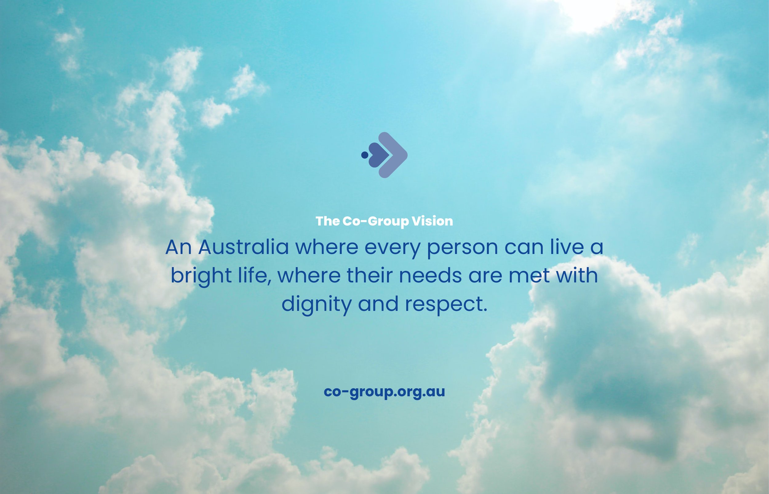
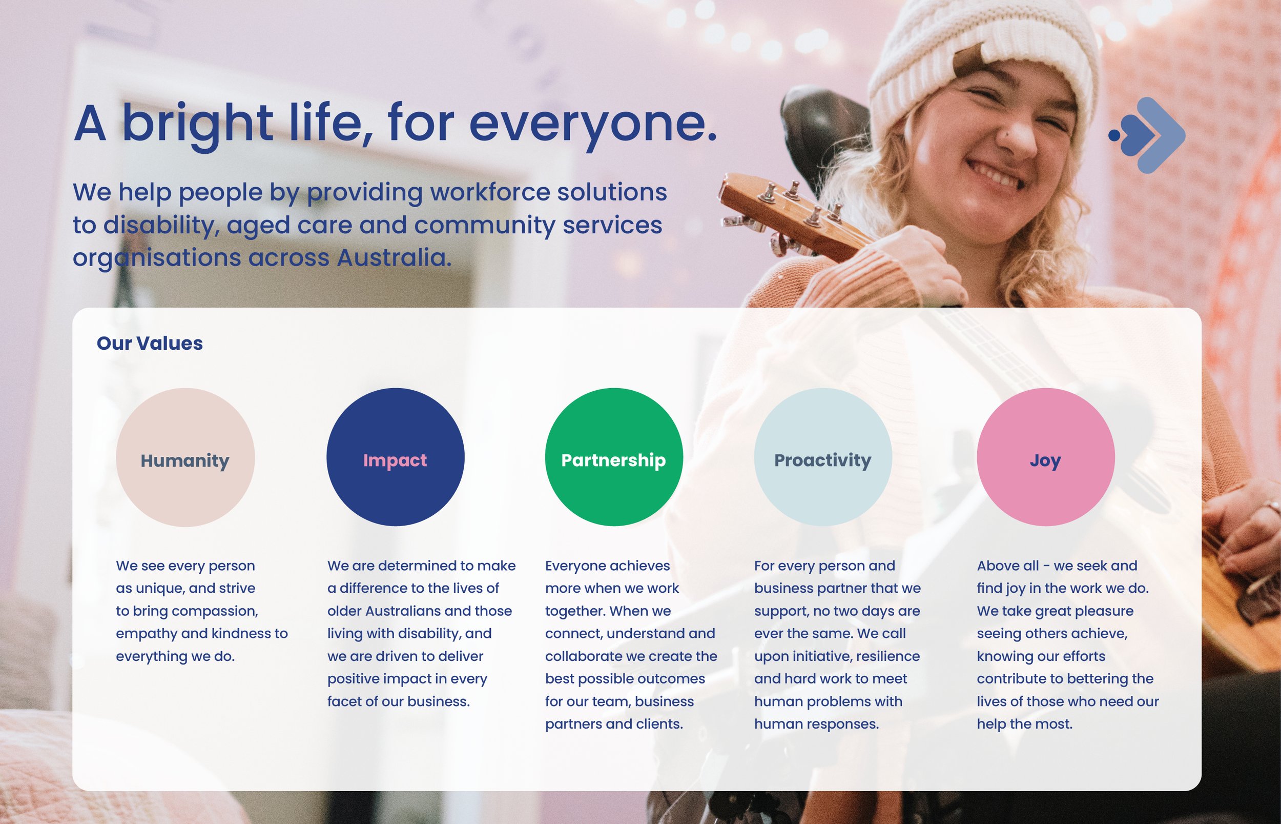
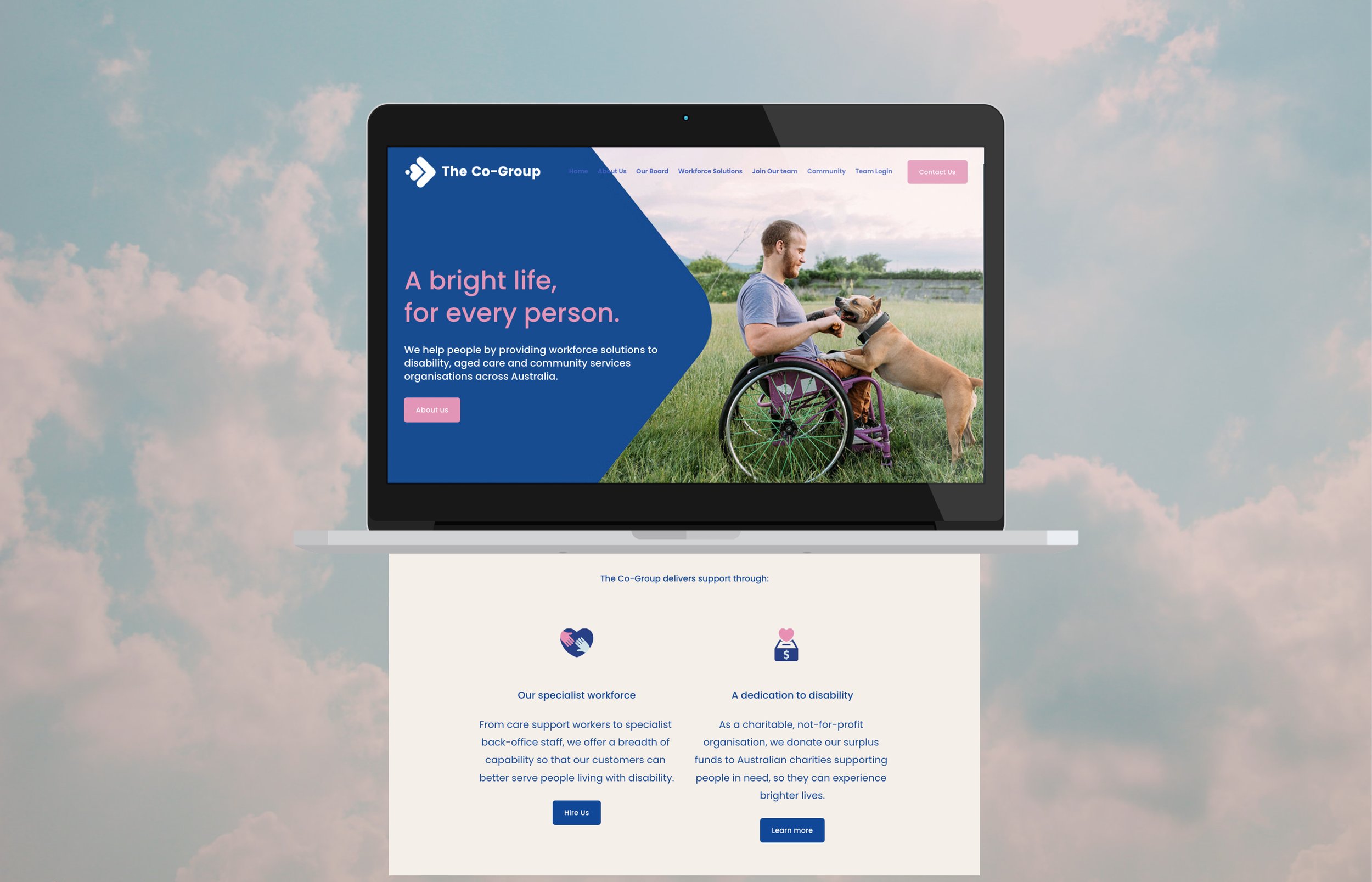
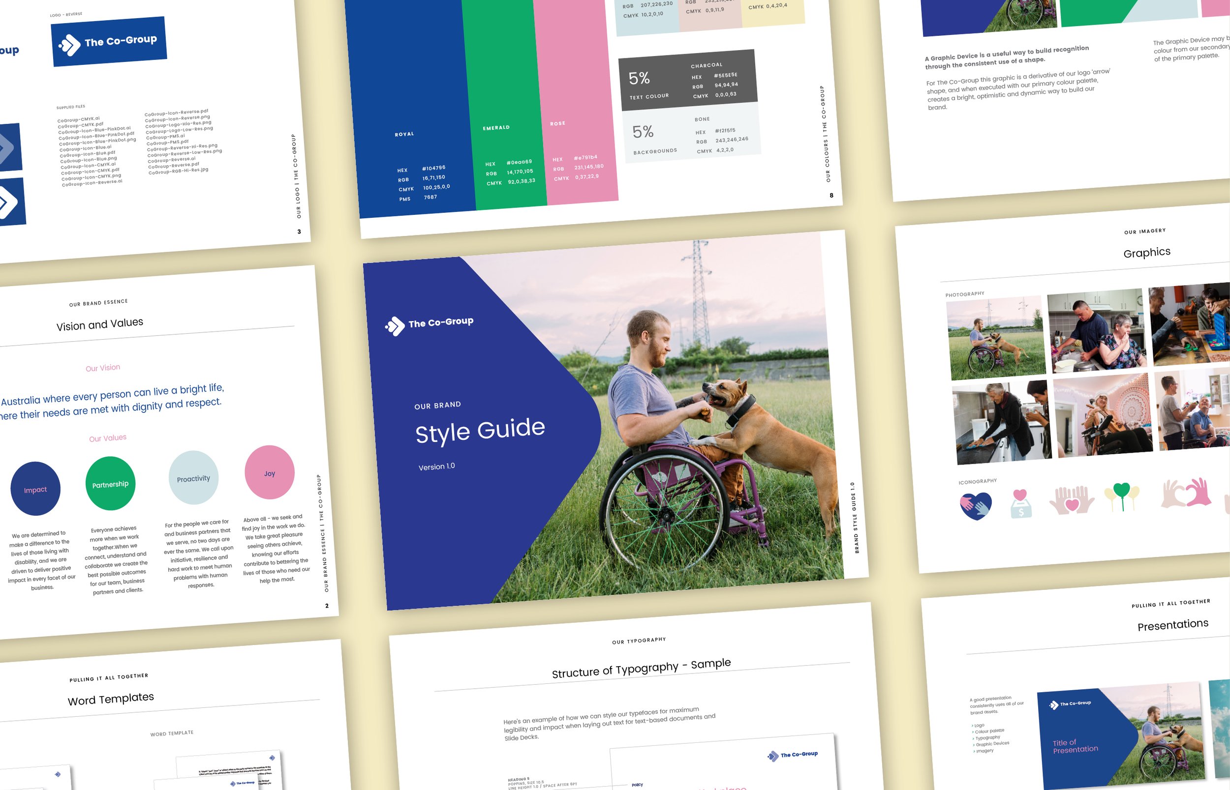
The brand value of ‘humanity’ led the creative process: it was really important that the creative be able to convey that the Co-Group is an organisation full of people with heart, who are assisting people with heart. That’s where the tagline ‘A bright life, for every person’ was born.
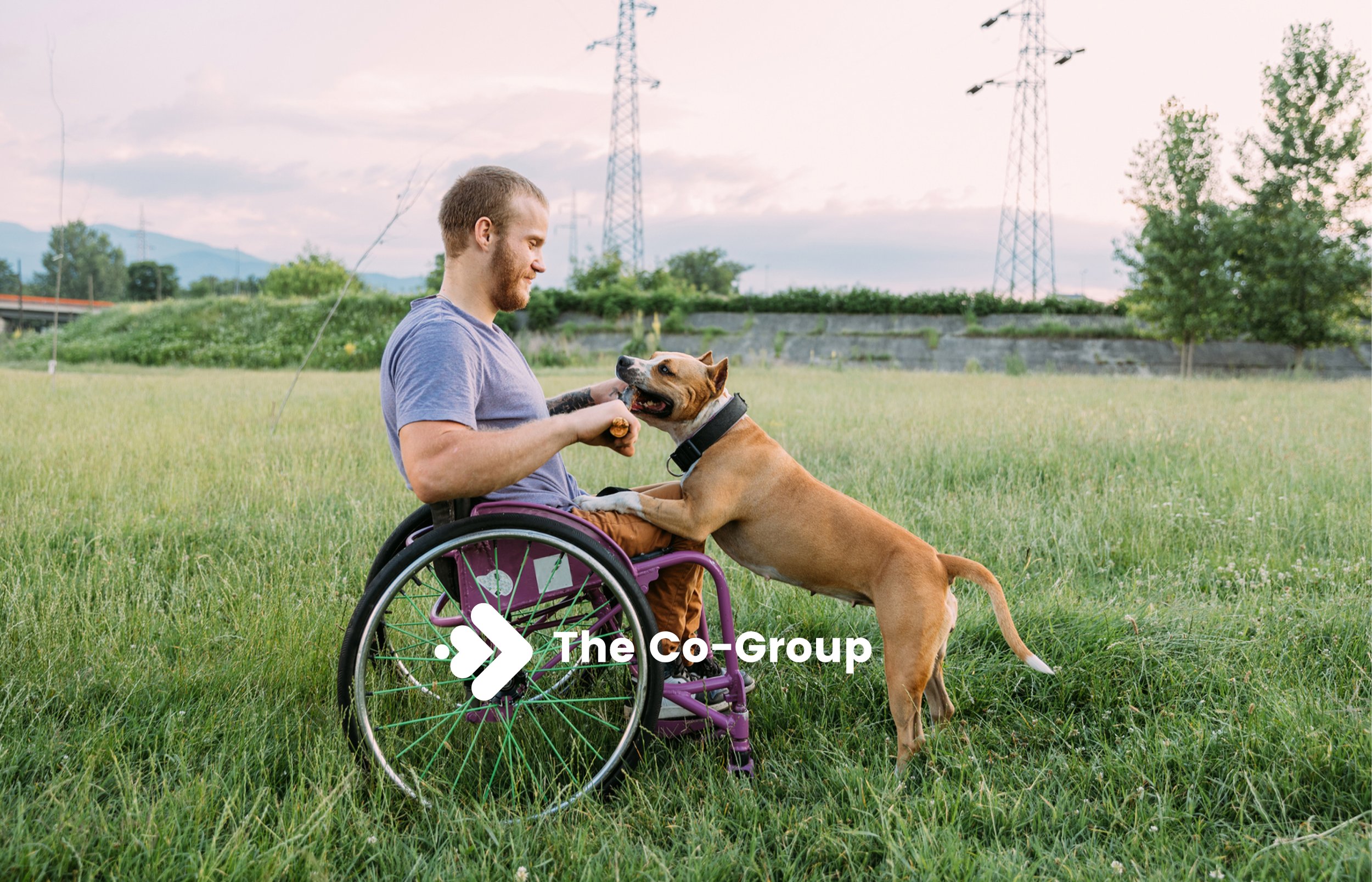
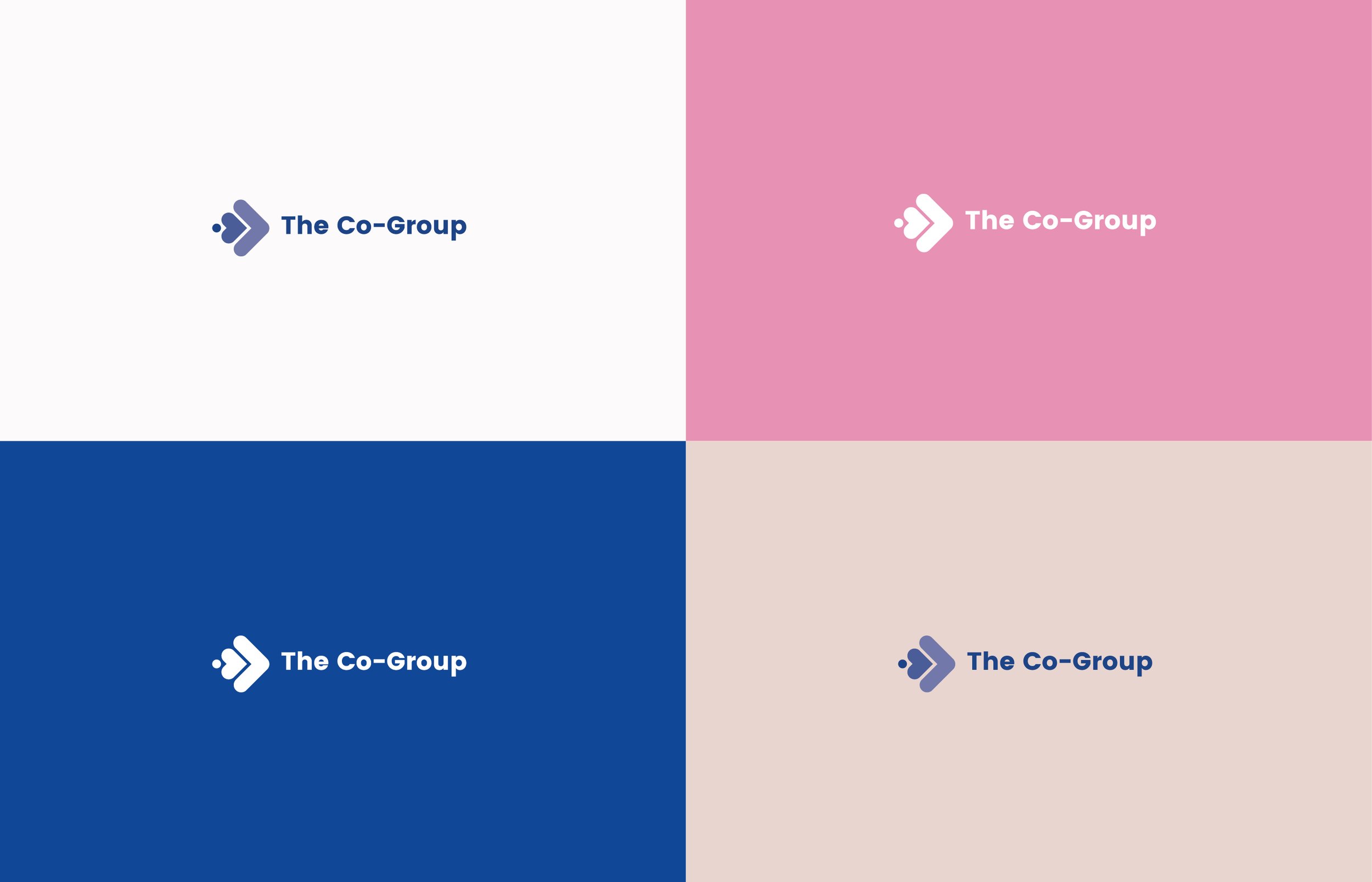
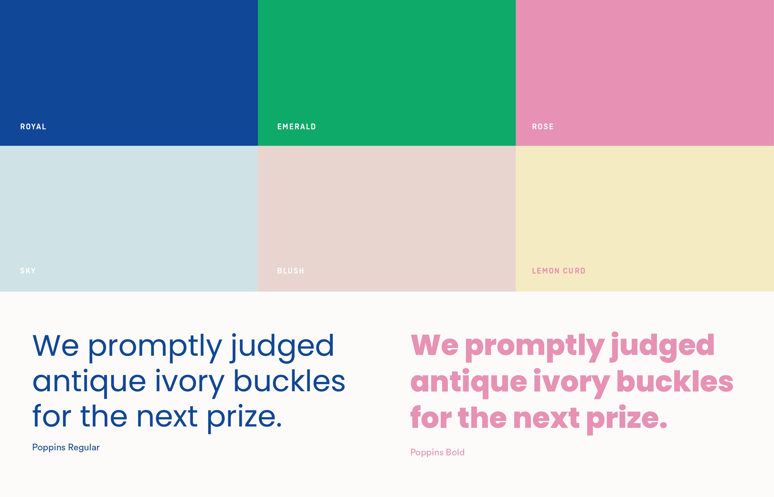
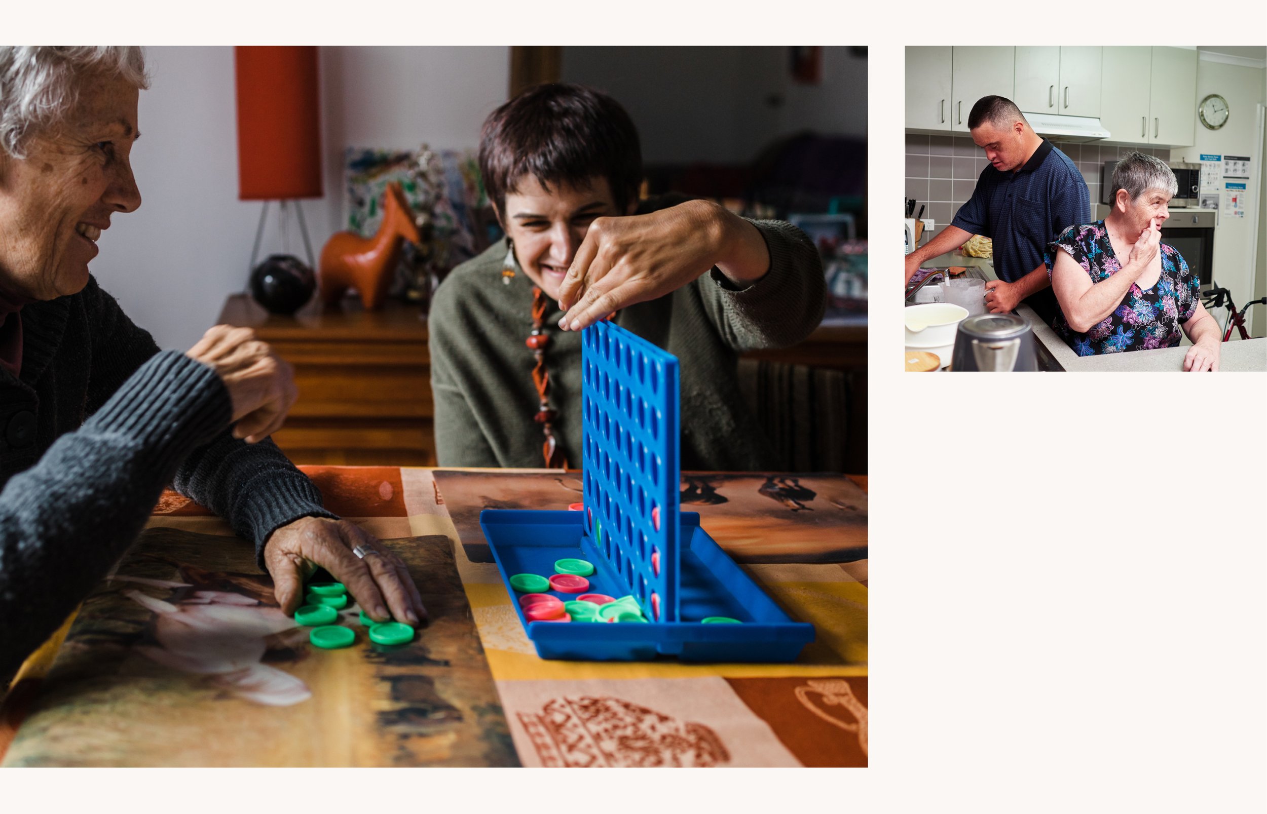
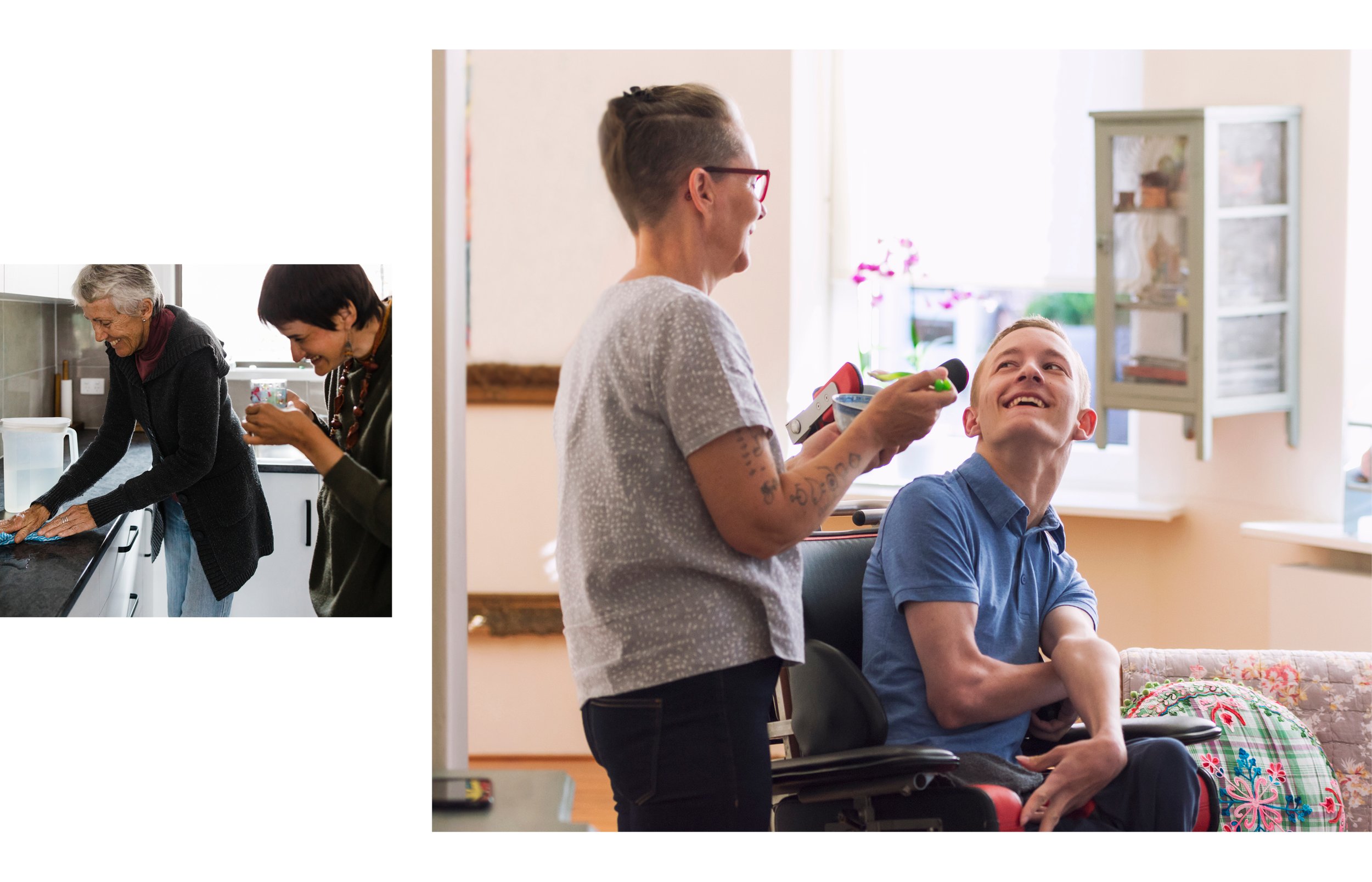
To support this, we wove a subtle heart into the logo, and paired this with a bright, bold palette of simple colours — including pink — to enable the key messages to sing with both simplicity and humanity. We supported this with an exhaustive stock photo search — no cheese allowed — where we were able to procure a set of images that conveyed the richness of life that people with disability can access, with the right help.
Here’s a quick look at what we achieved:
What a great experience. Thank you The Co-Group for trusting Amadeus with such an important task! It’s been a real highlight of 2020.