
AsiaLink — Annual Report Design
I love it when I get SOS’s from my clients. The exact words were: ‘Looking for a unicorn’. Their other design firm had let them down on the development of their Annual Report, and could I have it finished in five days time?
I was heading away for the weekend, which wiped out three days. I assured her I could have it finished, but not until the final day. All agreed, I enjoyed my weekend and pumped out the hours upon my return. I relish these challenges!
Working with an existing brand
Often charged with executing on existing brands, it’s work I perversely enjoy. It’s a skill I’ve developed over the years, always looking for ways to extend and leverage the brand in new ways, without coming under scrutiny from the brand custodians.
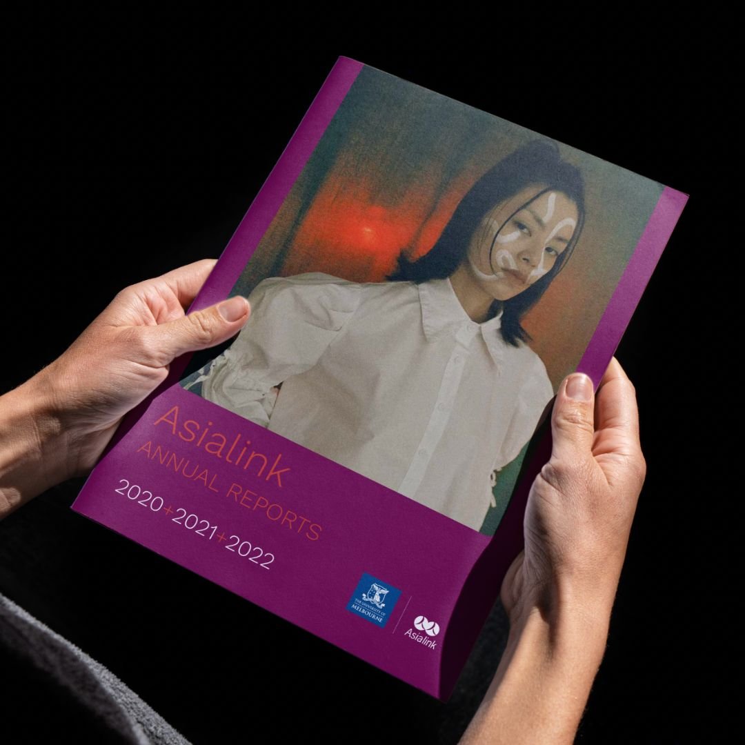
This was such a case with AsiaLink — an initiative jointly shared with with the University of Melbourne. The typeface, Work Sans, is reasonably vanilla, but I found a way to use the Thin weight to great effect. Their colour palette was gorgeous, and reflected the Asian heritage of the brand. By finding beautiful, full-bleed imagery, I was able to bring the brand to life, whilst keeping a reasonably corporate grid and layout. It was an annual report after all, and these things benefit from function over form; fancy design can impede the legibility of a document such as this.
The Annual Report design